DÉCIMO NONO LIVRO
MY ARCHED AND SOMEWHAT ROMAN MANNER
My arched and somewhat Roman manner had lingered dormant for some years. Quite early on there had been a few flat-arched houses and others. Later the arches had become rows of shells on the roofs of larger buildings but it was only in the little hotel on Mozambique island that it began to turn quite Roman and somewhat monumental. The hotel was going to be built using in part the technology of the eighteenth and nineteenth century builders of the island's palaces, with coral stone and adze cut timbers, beamed ceilings and hardwood louvres and screens. The promised loan did not materialise and the hotel was never built, but it later turned into the Red House in Lourenço Marques - a back-to-back twin for two doctors with wives' studios up in the roofs.
|
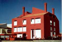
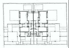
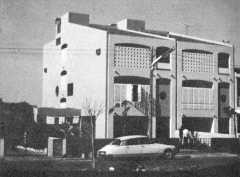
The Red House was generated on a checkerboard, plotted on a grid - it is a modular twin enriched by some complications, some confusions and a number of mistakes introduced to resolve some of the wishes of its very temporary owners and some of the needs of the architecture. The two houses are symmetrical about a central party wall - each a mirrored image of the other apart from negligible differences The two main facades are also mirrored versions of each other and each break up visually into two sectors. Each of the two lateral facades is symmetrical and forms an entity disturbed by a number of cockeyed and wide-eyed duplications of elements. The Red House appears fortified. Its walls seem to be very thick. This appearance of thickness results from the use of the external walls and some of the interior ones as walls of cupboards, niches and light recesses with windows and doors built in on the inner faces. The openings are mostly screened by rectangular louvres which miss the springing of the flat arches. Those screens give the interior of the houses an introverted character and the light is cool and diffused. When the sun strikes a facade and some of the screen panels are open the interiors are marked by bold. narrow shafts of sunlight. |
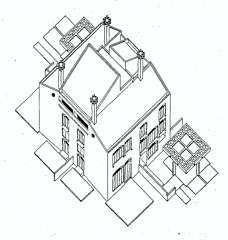
The facades are both too small and too big. Each facade is a large flat wall plane with cut out openings and protruding waterspouts. Most of the cut out and deep openings are assumed to be the height of ordinary doors; they are in reality a little smaller. The two larger openings on each main elevation, when read as doors knock out the first attempt at reading the other openings as being door size, they become windows. When considered again the house becomes half as large, which is impossible when checked against the nelghbours and the second reading breaks down. At the third turn one accepts both readings simultaneously but with doubtful reservations. The Red House remains both too big and too small. The roofs build up to two wedge volumes, one roughly four times larger then the other and separated by a wide gap. The Red House is transfixed by four tall candelabra chimneys in transitory positions. The four chimneys demarcate a single territory for themselves and further disturb the scale of the facade. |
|
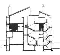
A visit to the interior of either house clarifies some of the questions raised outside. The first two floors incorporate double volumes. These spaces are puns on that famous heroic period section of Corbs in the Maison Citrohan which is a recurrent obsession. |
 |
 |
After the revolution, Red House was so afraid that it becomes white. I liked it so much that, later, I made a model to have always with me. |
| I designed two more arched houses in Mozambique, like the Twin houses in Carrelra de Tiro but it was recently that I returned to that manner of mine. |
| HOME PAGE | CONTENTS PAGE | PREVIOUS PAGE | NEXT PAGE |

