SÉTIMO LIVRO
FORTYEIGHT BLUE AND WHITE LITTLE BANKS ON THE EAST COAST OF AFRICA AND TEN OTHER BLACK AND WHITE ONES ON THE OTHER SIDE
 |
Sometimes I would make drawings for these banks on my knees, flying between one small town and another in Mozambique.
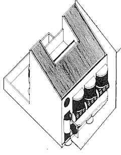
Most of these agencies were built into existing buildings, buildings half finished or buildings just begun - all rented by the bank. Sometimes there would be no building to rent, so I would design a new one and build it with the bank's own people.
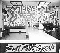
They were all different but for the sake of identity they all had a number of features in common. These were the incredibly intense blue and white colour schemes, the white marble counters, the dark thick and heavy hardwood shop fronts and doors, and the light boxes. Their stuck-on partial facades often turned into rows of monumental T's.
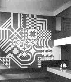 |
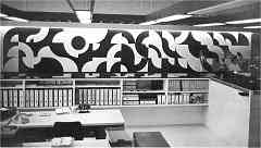
The blue and white murals were mostly of the same geometrized and complex family with occasional deviations such as the one at Quelimane which turned into a portrait of the Zambezi River.
|
|
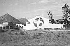
The Bank's emblem in the larger towns made up of parts in stainless steel but in small towns and villages - it often was just cut into the plaster of the façades and painted. They got more and more overscaled.
|
 |
|
|
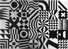
Those other little agencies I designed all over Angola for a sister bank were in black and white. Their geometries ware far more agitated and intense and their graphics much larger. |
| HOME PAGE | CONTENTS PAGE | PREVIOUS PAGE | NEXT PAGE |